Getting Started
A quick tutorial to get you up and running with DGI-UI.
Building Your UI Library
After installation, you're set to start crafting your UI library.
Now, you've got two options:
- Grab the whole shebang of components and dump them into your project.
- Cherry-pick the specific pieces you need and drop them in manually.
Downloading All Components
If you’re kicking off a new project and crave a full, dazzling array of UI delights, snagging the whole UI library is your ultimate move.
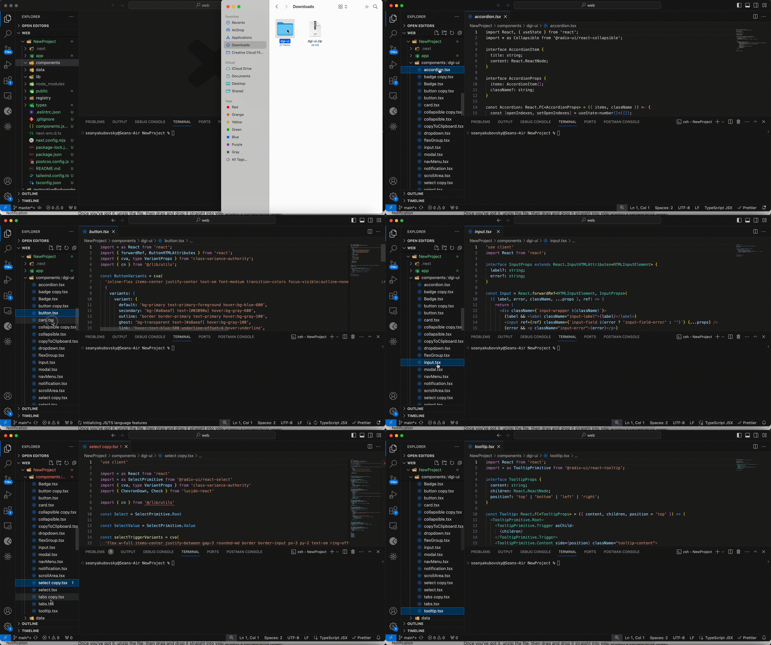
Grab the components/UI folder right onto your computer.
Once you've got it, unzip the file, then drag and drop it straight into your project's components folder.

Don't forget to glance at the docs for each component as you use them.
Manually Adding Components
Adding components manually, as needed, is a brilliant strategy for maintaining a sleek, minimal UI, stripped of excess. This approach guarantees your interface remains streamlined and cohesive, adorned only with the essentials that harmonize with your project's aesthetic.
Craft your UI components folder
Create a components folder with a UI subfolder.
Here's a tried-and-true method for structuring components:
Select which component you would like to use
In this example we will be adding the Modal component.
Create a new file inside your components/ui folder
Let's name it modal.tsx
Follow the installation process for the specific component.
To get started with the Modal component, install the necessary dependencies.
Now, take that provided code and place it into your modal.tsx file.
Now, the final step is to align the import paths with your project's configuration.